

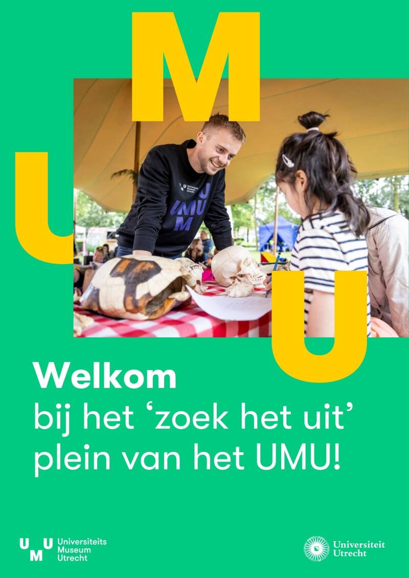
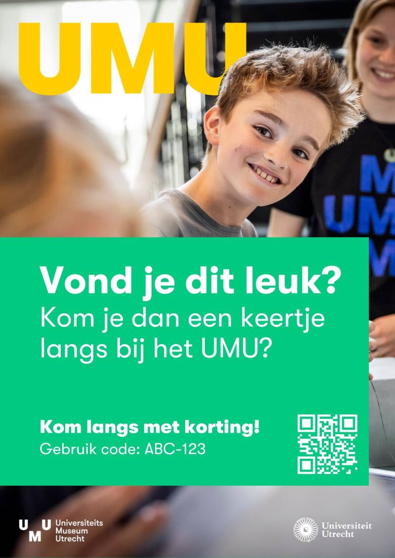
Posters
Logo Design
Lis Hartel+
Lis Hartel+ is a horse riding school focused on creating a positive riding experience for everyone, where the wellbeing of both horses and riders is of central importance. Their approach is tailored to each individual, ensuring that everyone can ride and feels welcome.
The logmark depicts the horse’s mane transforming into the “soft hand” motion, a gesture that signifies gentleness and care. The colours echo their all-natural, outdoor practices.

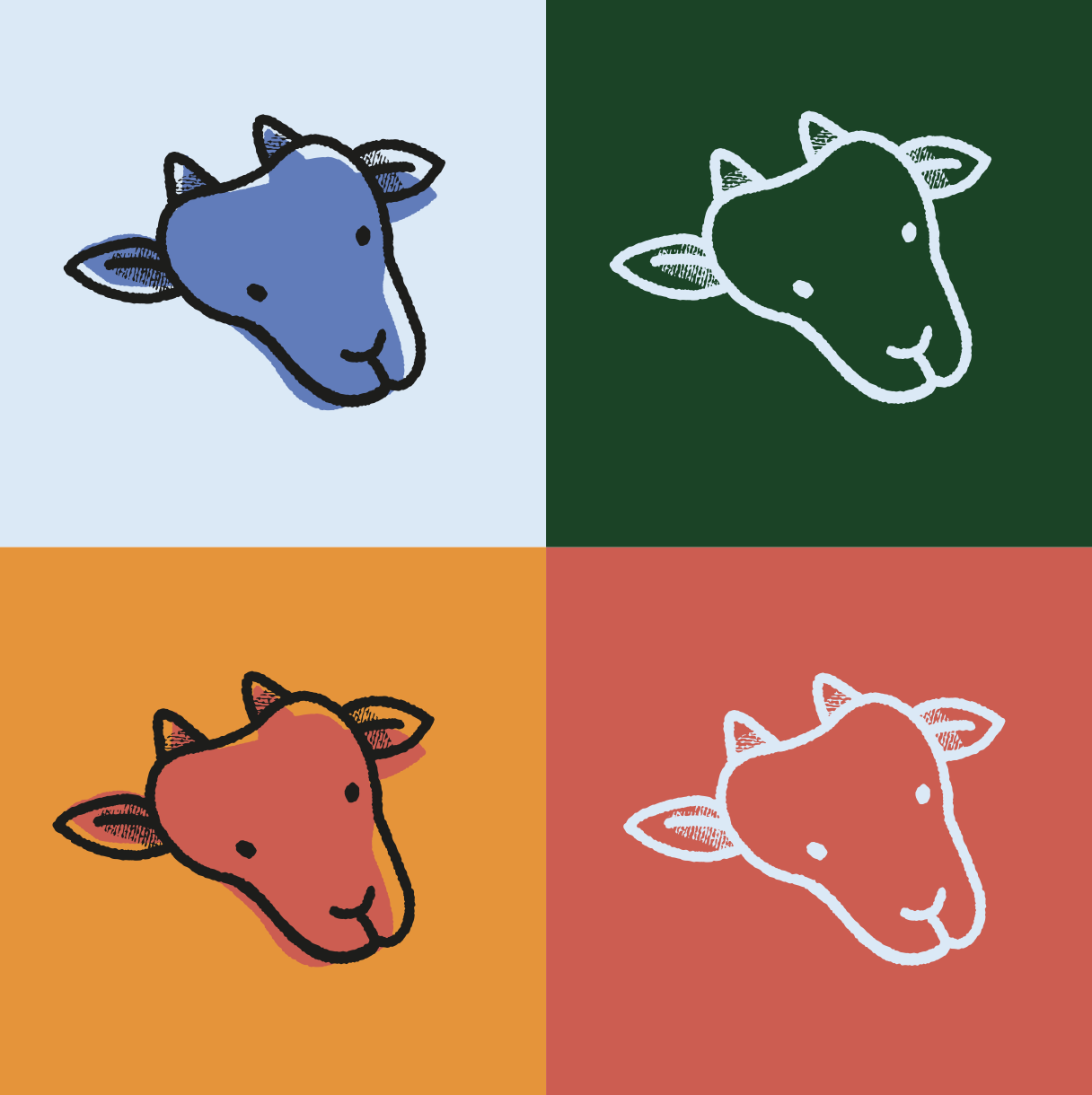
't Woelige Nest
This logo concept was made for my local petting zoo. It was a great experience to work with the petting zoo to create a logo that reflected their roots but with a more current and colourful approach.
This final design is retro inspired design featuring a "stamped" goat logo mark to inspire a playful and childlike feeling.

Tide HR
This logo for a modern HR business was inspired by a calm beachy oasis. The companies keywords implemented in this design are "New and Modern", "flowy", and "calm"
Image translation: This font is a script. It gives a more personal feeling, like it is written by yourself. - In the logo the wave is utilised like a line underneath a signature.

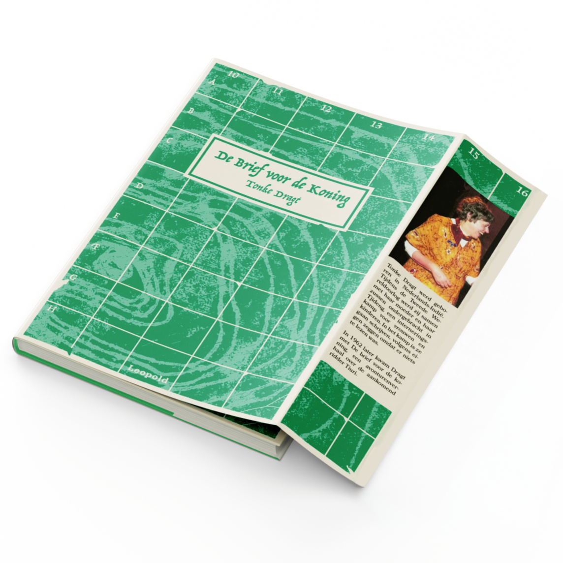
Book Covers


Create Your Own Website With JouwWeb